Research:WordpressVsDreamweaver
There are two ways of creating a website. Dreamweaver uses HTML coding. Whereas, Wordpress is a website that have different themes and templates that can be used by Wordpress members and customise it to become their own websites. However, Wordpress is quite limited unless you change the CSS and use HTML codes to have full control. Dreamweaver is an Adobe software to create a website from scratch. I want to start creating my website, however I am torn by both techniques and need to choose one now.
Both techniques are quite new to me. I have never used any of these techniques so by the help of Lynda.com and lecturers they will both help me choose the right technique.
After looking at Lynda.com I have decided to create my website on Wordpress.org as it is easier and very simple to create my website as it has themes to choose from. However, using Wordpress is a little more complicated to make the website live. To make the website live, I will have to download a program called FileZilla which helps me setup my website.
My next step is to figure out what name I want to use for my website. The name I went with is OneonOneBeauty.com then try to find a way to find a website host. The website host I found is One.com that gives me all these setup information to hook it up to FileZilla. Once I have moved all important files I can start using Wordpress.org to create my website.
Thursday, January 2, 2014
Research: Website Names
Research:WebsiteName
Finally I came to the stage where I know what type of website I want to produce, the different and many multi-media content, the purpose, how to access and how audience can use my website as an entertaining and educational way. Now I need to find out what my website should be called. It needs to be an obvious website name that has something to do with beauty, make-up, natural products and confidence. Some of the website name ideas are here bellow:
- Beauty 101
- Beauty Advice
- One on One Beauty
- Feeling Beautiful
- One on One Talk
- Advice For Girls
- Be Confident
- Love Your Body
All of these names that I have listed have something to do with beauty, and I am aiming to make my website name globally. For example; Beauty101.com instead of Beauty101.co.uk to Beauty101.eu.uk as there will be a limitations to my audience. I want a bigger target audience, so that is why I aim to have a website that is international, and be viewed by other people in different countries.
Finally I came to the stage where I know what type of website I want to produce, the different and many multi-media content, the purpose, how to access and how audience can use my website as an entertaining and educational way. Now I need to find out what my website should be called. It needs to be an obvious website name that has something to do with beauty, make-up, natural products and confidence. Some of the website name ideas are here bellow:
- Beauty 101
- Beauty Advice
- One on One Beauty
- Feeling Beautiful
- One on One Talk
- Advice For Girls
- Be Confident
- Love Your Body
All of these names that I have listed have something to do with beauty, and I am aiming to make my website name globally. For example; Beauty101.com instead of Beauty101.co.uk to Beauty101.eu.uk as there will be a limitations to my audience. I want a bigger target audience, so that is why I aim to have a website that is international, and be viewed by other people in different countries.
Research: Accessibility & Usability
Research:Accessibility&Usability
How can I make my website accessible? How is my website usable?
In this post I will explaining how I want my website to look and be accessible to the audience, and I need to create a valid reason why my website is usable.
Starting off with the accessibility. The access that has been created on websites that I have analysed recently are quite accessible. What I mean about accessibility is that the audience can access different categories such as different products, different subjects and so on. Audience can access music, access photos and videos that have been taken by the creator or that has been shared on the website such as images that have had their URL copied onto the website. I want to make it possible for the audience to access different kind of contents on my website.
Usability is how the audience use the website. The audience can use videos to watch and learn something from it, for example my beauty website will contain some videos with tutorials for a step by step Halloween make-up. Images can also be used to be seen by audiences to see what subject I am talking about. The other usable and useful thing to do on the website is to go on the contact page. For example if someone wants to promote you or ask questions they could go on the contact page to get some contact details such as emails, FaceBook account or Twitter account.
How can I make my website accessible? How is my website usable?
In this post I will explaining how I want my website to look and be accessible to the audience, and I need to create a valid reason why my website is usable.
Starting off with the accessibility. The access that has been created on websites that I have analysed recently are quite accessible. What I mean about accessibility is that the audience can access different categories such as different products, different subjects and so on. Audience can access music, access photos and videos that have been taken by the creator or that has been shared on the website such as images that have had their URL copied onto the website. I want to make it possible for the audience to access different kind of contents on my website.
Usability is how the audience use the website. The audience can use videos to watch and learn something from it, for example my beauty website will contain some videos with tutorials for a step by step Halloween make-up. Images can also be used to be seen by audiences to see what subject I am talking about. The other usable and useful thing to do on the website is to go on the contact page. For example if someone wants to promote you or ask questions they could go on the contact page to get some contact details such as emails, FaceBook account or Twitter account.
Research: Layout
Research:Layout
This is another image of the Apple website. This time I am on the 'Mac' menu, which shows the different Mac products they have. I like how they show the images of different Macs because it is a unique and creative way to help the audience find the results quick and easier. I was also thinking to have a sub-menu on my menu for more selections to choose from. Another large image to promote the 'MacPad' so the audience notice the new product that is most likely a popular product and attracting the audience. I could also use that similar page layout that Apple used, big images and a lot of selections to choose from.
Another website I want to analyse is www.makeupandbeautyblog.com which is a beauty blog that has been created by a YouTube tutorial artist that embeds her YouTube videos, images of the product reviews, tips and advice. I have used this website as an example so many times, it also inspired me to create my website and have sort of the same concept and content. The website's page layout isn't the kind of page layout I want for my website. However, the menu on the homepage is pretty impressive. Not only the menu is impressive, but the little slide show on top is also creative. This makes me want to create a slide show on my website. The menu is really creative. Once you move your mouse onto the categories such as 'Eyes' the black and white image changes into colours. However, this is about the layout. The layout is quite simple, most websites have this kind of layout. The menu is quite short, but it also has a sub-menu that gives you more selections. The search bar is also near the menu, so it is a fast track for the readers to search and get the best result quicker. The bottom are just recent posts that have been posted on the website blog. I'm not too fond of the posts that are at the bottom of the homepage, it is too much clutter, isn't too attractive. The most annoying part of this website is where the adverts are placed. I understand to get promoted and have a successful website it is best to advertise. However, it could have been placed on the side of the page, instead of the centre on top of the homepage which is really distracting and doesn't compliment the colours of the page.
In this post I will be discussing
the type of layout I want for my website. I will also look at different
websites that have something to do with beauty and fashion, and analyse the
kind of layout they have used for their website. A page layout is the part of
graphic design that deals in the arrangement and style treatment of elements on
a page. Example, the content on the page. The reason why I want to focus on the
layout of the website is because the page layout plays a big part in quality as
it affects the user interface design. The design of the page layout is broken
down into units such as sidebars, embedded videos and pictures, navigation
areas and so on. This is exactly what I'll be looking at. I will look at
different websites and analyse where each unit is placed, why and how does that
satisfy the reader.
Of course, it is not a fashion
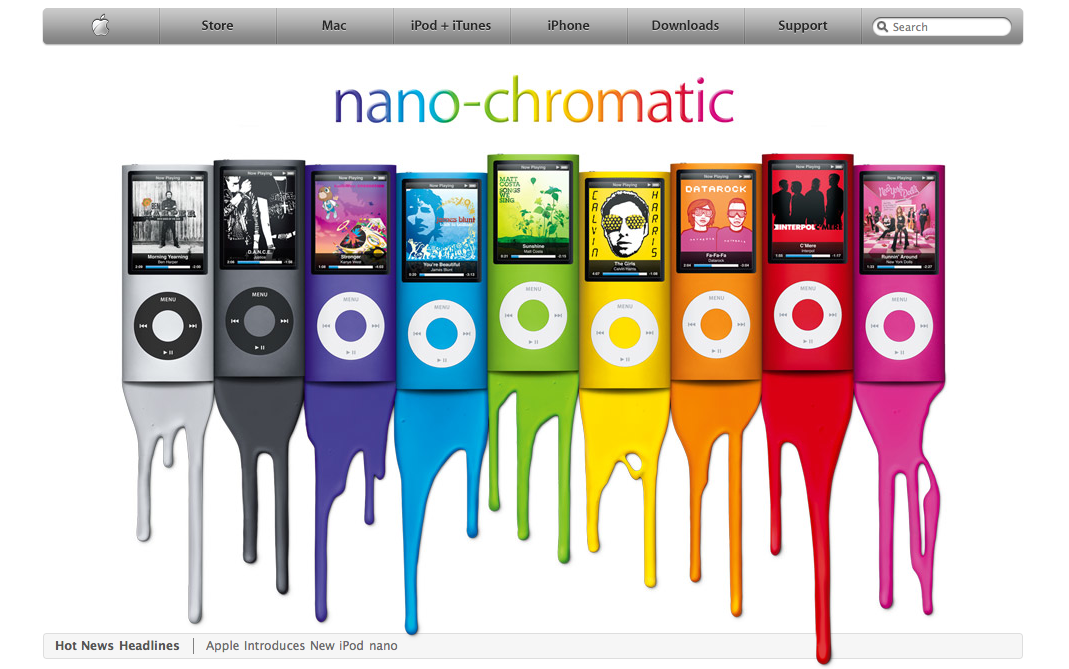
nor a beauty website however I like the way Apple have designed their page layout as it is close to the one I have in mind. The first unit I will be discussing is the sidebar that is place on top of the page. The side bar consists of the following; Store, Mac, iPod+iTunes, iPhone, Downloads and Support. A creative way to go onto the Apple homepage is to press the Apple logo. Along the sidebar is a search bar to search the type of product the reader is looking for. All the essential units such as the different products, the music, support, who to contact and to search for something for a quicker result. All the units in one place makes it really easy for the reader and it is pleasant to look at the bar. It isn't all squashed, easy to read and attracts the audience by the typography that has been used. The image is my favourite unit that has been used on the website. The reason why I like the position of the image is because it takes up the whole space of the website, so the audience focus on the promotion or item that Apple is trying sell.
This is another image of the Apple website. This time I am on the 'Mac' menu, which shows the different Mac products they have. I like how they show the images of different Macs because it is a unique and creative way to help the audience find the results quick and easier. I was also thinking to have a sub-menu on my menu for more selections to choose from. Another large image to promote the 'MacPad' so the audience notice the new product that is most likely a popular product and attracting the audience. I could also use that similar page layout that Apple used, big images and a lot of selections to choose from.
Another website I want to analyse is www.makeupandbeautyblog.com which is a beauty blog that has been created by a YouTube tutorial artist that embeds her YouTube videos, images of the product reviews, tips and advice. I have used this website as an example so many times, it also inspired me to create my website and have sort of the same concept and content. The website's page layout isn't the kind of page layout I want for my website. However, the menu on the homepage is pretty impressive. Not only the menu is impressive, but the little slide show on top is also creative. This makes me want to create a slide show on my website. The menu is really creative. Once you move your mouse onto the categories such as 'Eyes' the black and white image changes into colours. However, this is about the layout. The layout is quite simple, most websites have this kind of layout. The menu is quite short, but it also has a sub-menu that gives you more selections. The search bar is also near the menu, so it is a fast track for the readers to search and get the best result quicker. The bottom are just recent posts that have been posted on the website blog. I'm not too fond of the posts that are at the bottom of the homepage, it is too much clutter, isn't too attractive. The most annoying part of this website is where the adverts are placed. I understand to get promoted and have a successful website it is best to advertise. However, it could have been placed on the side of the page, instead of the centre on top of the homepage which is really distracting and doesn't compliment the colours of the page.
Wednesday, December 25, 2013
Research: Moodboard
Research:MoodBoard
In this post, I am showing two moodboards. A moodboard is basically something like a collage. The point of the moodboard is to collect images that inspire you and has something to do with the idea you have. For instance, my idea is to make a beauty website so I have searched different kinds of images that portray make-up, hair, body etc.My first moodboard is about make-up and fashionable accessories.
The second moodboard is about natural beauty. How to look after your hair, nails, face and body with both natural recipes and products on the shelf.
Research: Typography & Text
Research:Typography&Text
'Typography (from the Greek words τύπος (typos) = form and γραφή (graphe) = writing) is the art and technique of arranging type in order to make language visible'.
Typography is part of design and how the audience interact with the website. Overall, I want my website to have a visual look and feel to it. In this post I will be researching different types of font, structure of the text and colours as I need to plan how my information will be presented and organised on my site.
I'll be doing primary and secondary research. First, I will be doing my secondary research that will consist of different websites that I have looked at. By analysing the different texts the websites have used will help me plan the right text I want to use for my website. I will be looking at how the information is being presented (such as colours, paragraphing, headlines, sub-headlines etc). The websites that I will be looking at are the same websites I have listed and showed on a previous post. The reason why I'll be using the same websites is because they all use different type of fonts, colours and the use of paragraphs.
The first website I'll be looking at is ASOS. I chose this website because I like the way the text has been organised. It seems like there is a heading for example 'NEW YEAR'S EVE' which is bold and in capital letters. Below is a sentence that basically explains what this post is all about. The little information under the heading says 'Count down of the biggest night of the year with supercharged party pieces'. Right under it, it has the option to view the post, which is also in capital letters and bold to capture the reader's attention. It is readable and this is what I like about this. It not all 'chunked' up.
SimplyBe's text doesn't satisfy me and puts me off reading the text. Firstly, I do not like the way the text has been placed, for example; 'FASHION' as part of the menu. I used SimplyBe's homepage to show an example of a 'chunked' text. It may not be a long 'essay' but the text are too close to each other, the font is very simple and not creative (even though fashion is a creative industry) and puts me off reading it or even using the website to purchase anything.
I used Photoshop to test out some of the fonts and colours. I have used at least four different fonts in this one. I have tested out the colours but I have tested out how to place the text. For example, the name of my website is OneonOneBeauty.com and the tagline is 'Look Beautiful. Feel Beautiful'. I wanted to use two different fonts, one for the heading and a different one for the tagline. I also used different sizes. Tagline would be a smaller size so the audience notice the bigger sized font as it is the name of my website. I like to keep colours simple. Other fashion and beauty websites I have seen usually use the colour black. I like to have a little bit of colour. So, I'll use pastel colours as they are very subtle instead of using bright colours as some readers can't handle bright colours and won't be able to read it.
'Typography (from the Greek words τύπος (typos) = form and γραφή (graphe) = writing) is the art and technique of arranging type in order to make language visible'.
Typography is part of design and how the audience interact with the website. Overall, I want my website to have a visual look and feel to it. In this post I will be researching different types of font, structure of the text and colours as I need to plan how my information will be presented and organised on my site.
I'll be doing primary and secondary research. First, I will be doing my secondary research that will consist of different websites that I have looked at. By analysing the different texts the websites have used will help me plan the right text I want to use for my website. I will be looking at how the information is being presented (such as colours, paragraphing, headlines, sub-headlines etc). The websites that I will be looking at are the same websites I have listed and showed on a previous post. The reason why I'll be using the same websites is because they all use different type of fonts, colours and the use of paragraphs.
The first website I'll be looking at is ASOS. I chose this website because I like the way the text has been organised. It seems like there is a heading for example 'NEW YEAR'S EVE' which is bold and in capital letters. Below is a sentence that basically explains what this post is all about. The little information under the heading says 'Count down of the biggest night of the year with supercharged party pieces'. Right under it, it has the option to view the post, which is also in capital letters and bold to capture the reader's attention. It is readable and this is what I like about this. It not all 'chunked' up.
SimplyBe's text doesn't satisfy me and puts me off reading the text. Firstly, I do not like the way the text has been placed, for example; 'FASHION' as part of the menu. I used SimplyBe's homepage to show an example of a 'chunked' text. It may not be a long 'essay' but the text are too close to each other, the font is very simple and not creative (even though fashion is a creative industry) and puts me off reading it or even using the website to purchase anything.
I used Photoshop to test out some of the fonts and colours. I have used at least four different fonts in this one. I have tested out the colours but I have tested out how to place the text. For example, the name of my website is OneonOneBeauty.com and the tagline is 'Look Beautiful. Feel Beautiful'. I wanted to use two different fonts, one for the heading and a different one for the tagline. I also used different sizes. Tagline would be a smaller size so the audience notice the bigger sized font as it is the name of my website. I like to keep colours simple. Other fashion and beauty websites I have seen usually use the colour black. I like to have a little bit of colour. So, I'll use pastel colours as they are very subtle instead of using bright colours as some readers can't handle bright colours and won't be able to read it.
Monday, November 4, 2013
My Proposal
Multi-Media Production – My Proposal
INTRODUCTION
In the first term of this module, I will be producing a
website and a blog. The blog will contain my research, planning and progress
throughout the process of making a website. In my website I will try to use
different combinations of different contents such as audio, still images,
moving footage, interactivity and text. These contents make up multimedia. I
will be producing a website by using software called Adobe Dreamweaver and this
will help me create a creative website because of the tools in the software. I
will also do primary and secondary research to produce an effective website.
CONCEPT
& PURPOSE
The overall concept of the website is going to be based on
beauty and fashion. In the past, I have taken fashion and textiles as a subject
in college. I usually follow the new fashion trends, and interested in looking
after your body. That is the reason why I want to create a fashion and beauty website
is because I am very passionate about it. I haven’t figured out the concept in
depth, but it is between a blog that contains fashion and beauty tips or a
store that sells beauty products and fashionable accessories. The first idea
will be about techniques that I will be doing. I will be uploading still images
accompanied by text that has something to do with beauty or fashion. For example,
I want to show the audience how to apply Halloween make-up. I will upload
images of the make-up (example: the eyes) and explain step by step how to apply
the make-up. After I could put the URL of the product I have used on my eyes.
For fashion, I can upload new fashion trends. For my second idea, I was
thinking to make a website that sells products such as jewellery, shoes and
beauty products. For that idea, I will be contacting the fashion students in
our University to volunteer to help. Their help will help the website as I can
use their products that they have produced in my online store.
The purpose
of the website is:
a)
Educating young and middle-aged women how to
apply specific make-up techniques.
b)
Entertaining the audience with the festival
make-up ideas (eg: Christmas).
c)
Helping audience with different fashion styles
and colours that match their skin tone.
d)
Updating the fashion trends (eg: Linking it to
Instagram fashion accounts).
e)
Boosting the audience’s confidence by beauty
products and tips to have a natural look.
TARGET AUDIENCE
I have been
researching websites that has something to do with fashion and beauty blogs and
online stores. In my previous
experiences, the websites I have been looking at that has online stores are
Boohoo.com and ASOS.com which are sites I am always on to find new trends and
buy the new trends. Because I am a female who is 20 years old, I figured their
target audience are similar ages. However, both online stores also target at
males as they have a male section on their online store. Most websites that
have blogs that have something to do with fashion and beauty always link it to
their Twitter, Facebook and Instagram pages. Usually, people who are on those
social network sites are teenagers that are between the ages of 14 – 25 (most
popular age groups). I figured out that I want my website’s audience to be the
same audience that ASOS and Boohoo target.
RESEARCH & TIME MANAGEMENT
So far I
have done some of the research for my website, such as topics and different
websites. I will continue the research as I am learning how to use different
software such as Adobe Dreamweaver, Adobe Illustrator and Adobe Flash. I will
also look at the HTML technique to create my web page. Before creating my
website on Dreamweaver, I will research accessibility, usability, navigation,
layout and typography. Afterwards, I will be updating my blog while creating my
website.
PROJECT TIMELINE
o
Week 1 – Research different websites,
concepts and think about a unique concept for the website. Start using
different colours on Photoshop.
o
Week 2 – Start thinking and write proposal.
The proposal needs to include a flowchart, moodboard, target audience, concept
and purpose.
o
Week 3 – Start learning Photoshop and
Dreamweaver techniques to apply to website. I can find some resources such as
Lynda.com and YouTube videos.
o
Week 4 – Start researching about
Dreamweaver in depth by taking books out of the Universities’ library. When
comfortable, start to learn about Adobe Flash. Finish off the proposal and
submit it on the study space online.
o
Week 5 – Start creating website.
o
Week 6 – Continue with website and blogging.
o
Week 7 – Upload the different
combinations of contents (text, images, videos, etc.)
o
Week 8 – Start searching which social
network I want to link with.
WIREFRAME
FLOWCHART
MOODBOARD
Subscribe to:
Posts (Atom)